
So… I have been working on my portfolio. But before anything, I started off this journey by trying to perceive ‘how is it done’ to ‘learn how to actually get it done good’. This post here is a part of my journey in this quest – to figure out the ‘how to get it done good’ part, and thus this post consists of 5 interesting Portfolio which I came across while searching as a part of my quest.
Point to note: Interesting ≠ good.
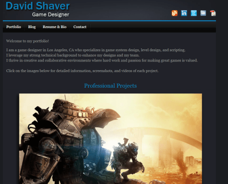
David Shaver – Game Design & Level Design
Portfolio – http://www.davidshaver.net/index.html
Resume – http://www.davidshaver.net/DavidShaver_Resume.pdf
Review
Starting with a small description, David has managed to explain his skills and profession in regards on how he can be put to use in a working company. The description was small and short to present the viewer a simple overview without overloading them. Following the description, David then presents his previous work experiences in the form of complete projects, in order to back up his skills and vision he instigated in the beginning with the description.
Without overcrowding the viewer with too many projects, David only selected handful of the good ones he worked on to present the areas he shined best. All of these things are once again formalized in the CV for better conclusion of David’s work. Although the CV repeats itself in accordance to the Portfolio, it still feels minimalistic and works as an overview for David’s potential, and for someone who wishes to just look at David profession without any gleam by side, the CV works best to describe/conclude everything which is needed to know about David.
To conclude, the presentation of the work itself isn’t dazzling, but it is indeed quite brilliant. One can learn everything to know about this person in as little time as possible, the presentation of his work was quite on point with everything he wanted to tell about himself.
My Takeout
Although I feel the presentation of work could have been better, regardless, the portfolio stated everything important there is to know about the person with pure simplicity. From this portfolio, I learned about the most important thing in presentation, to never overcrowd the viewer with too much of information, and to be clear with every information provided.
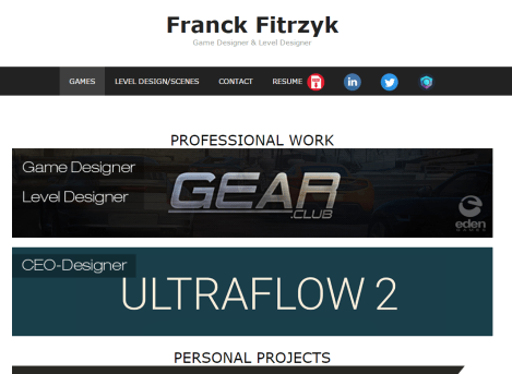
Franck Fitrzyk – Game Design & Level Design
Portfolio – http://franckfitrzyk.com/
Resume – http://franckfitrzyk.com/wp-content/uploads/2016/08/Franck-Fitrzyk_Resume.pdf
Review
The Portfolio consists of handful of games and some level design layouts Franck worked on. All the projects in the portfolio were presented and managed with elegance, they are capable of covering the viewer eyes with Franck’s experience without any form of text. This is quite interesting, without any text, Franck leaves the viewer with many social site links and projects as so the work speaks for itself.
One thing which will catch the eye of everyone viewing, is the CV visibly linked everywhere in the portfolio. The presentation of the CV is like a calling to the viewer to check more about Franck. The Resume is where the profession of Franck, and the background of the projects are actually detailed. The CV is quite big, and it covers everything else the portfolio failed to present. It is quite an eyeful of work presented, which actually might be too long for people to carry on reading it. But the spacing and the style of placement is pretty good to keep the viewer watching the CV till its end.
To Conclude, this portfolio although was pretty well presented, all of its defects were left to be filled in the CV. But still, everything manages to hold together without any missing information. At the end, it still feels like this could be done better with balancing the information without leaving everything to the CV itself.
My Takeout
The presentation of the work itself is neat to the eye, but at the end, projects are projects. I never really grasped the work Franck did until I looked at his Resume, which was again, quite overcrowded to look through. The Resume held its own till the end, but for someone who is in a hurry, I don’t think it can’t match similarly… For a person in hurry, he would just ignore the presentation on whole to the Resume without any knowing their actual context. There needs to be a good balance in the presentation of Portfolio on how much you rely on the Resume.
Ary Shirazi – Game Designer
Portfolio – http://www.arashshirazi.co.uk/
Resume – http://www.arashshirazi.co.uk/contact/

Review
The portfolio begins with a beautiful home page of the famous projects Ary worked on. For the viewers watching, the task arises to go through individual sections of the website to look for the Ary work. Although the idea of organizing everything to their aspect might sound and look good, but at the end, it only increases the work of viewer, as it demands the viewer to be active while viewing the Portfolio, to interact with it on each and every page. It might be hard for someone with slow internet speed to go through all the projects of the Portfolio. This could have been done better if the work is pinned in a single page with different categorization, but instead as it is now, this style will not present for everyone.
The CV is hidden in the Contact area under a single line. It might not even seem as a link, only on hovering over one can understand whether it is a link or not. On opening the CV, it is filled with many pictures and text. The pictures in the CV just straight up disable the viewer ability to read the text, to know about the skills of Ary. Besides the CV hiding somewhere, it turns out the CV is just plain overcrowded for someone who is just coming to know key information about you.
Above anything else, you can never pin-point who this Ary person actually is. At some point you get to face his picture, but you never get to know his skill pool or his actual experience. It is almost as the guy could do everything, and will be useful wherever you put him to work. But honing one’s skills in a particular department is always better than someone who can almost do anything. To conclude, this style might work out for some people. But, I don’t think this style is anywhere viable for exposure, this style exists only to present the one’s work.
My Takeout
The main reason for a portfolio is “Exposure”. You want everyone to look at you, and acknowledge you. I would have liked to go for this style of presentation, but it doesn’t fulfil the main purpose of a portfolio… Although I think it could have been much better with its presentation, the only thing I can learn from this portfolio is the “Organization” of work.
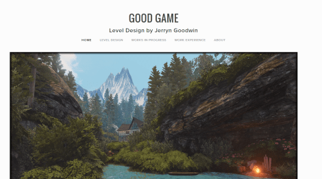
Jerry Goodwin – Level Designer
Portfolio – http://www.jerryngoodwin.com/
Resume – http://www.jerryngoodwin.com/work-experience/
Review
The Portfolio begins with a home page, with a big misleading title, which might actually make the viewer doubt this site to be a spam site, rather than a portfolio site. This first experience of a Portfolio might make the presenter lose his viewers in mere seconds. To follow this up, a huge beautiful picture is presented (with no context) to give a glimpse to the viewer on what this portfolio might come together. At first, it might just seem as an eye candy, and another reason to leave this site; but it actually turns out be a Game Level made by Jerry.
“Big” doesn’t always mean better. This website is the perfect example for this quote. Each of the projects made cover up more than two full screens to present; with no context and many links to different sites. Although the projects might seem really interesting, their presentation will throw any off just by the spacing given to them. It’s almost too hard to go through each and every project because of this…
It’s the same with the CV, while it only takes a single page to present, the single page is too long to scroll through to see everything as an overview. With the addition of Font, the text feels to be too big in comparison to the screen itself; It feels like the page contains automatic magnifier to look through this text… Even though the contents of the page are amazing! The spacing and organization of the content is too difficult to flow through, and at the end I never got to learn of the person profession and skills.
My Takeout
This is my perfect example on ‘how not to do a portfolio’. And if I had a list of top-ten ‘how not to do’, this will top the list without a second doubt. There is nothing I can learn from this portfolio except its failures, its in-ability to present the projects and about the person himself. Even the Title of the portfolio is misleading to the point where I had to open it twice to understand what it was.
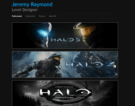
Jeremy Raymond – Level Designer
Portfolio – http://jraymond.squarespace.com/
Resume – http://jraymond.squarespace.com/resume/
Review
Jeremy Raymod put a lot of thought into the content organization of his portfolio. From the get-go of opening the Portfolio, the viewer can understand and can flow through the division of the organized elements, seemingly as planned on how they should work. It catches the viewer eye, and yet at the same time informs the reader about the content itself.
This is quite a difficult feat to achieve, presenting content while keeping the viewer attention. Each content presented had small description to follow up with the content being presented. It was as if, Jeremy even planned how the viewer will look at his portfolio, how the viewer will interact with his content.
But as the viewer progresses onto the Resume section of the Portfolio, not everything will be perfect as it seemed. The Resume had similar errors as in the Jerry Goodwin site. The Page was too long filled with filled with loads of text. Because of masses of text, the colors of the page became contradictory to the background of the page. This wasn’t the case for the content pages earlier because, the content was mostly a cluster of picture and videos. But in the Resume, all the viewer could face was Text; Lines after lines of text, there was nothing eye catching and it seemed too bland for anyone following this section. then again, the Resume section isn’t unbearable. It is an eye-sore sure, but to an extent, it gets its job done.
The viewer can understand about the person presenting and about the content itself. To finish it off, to end it with a bang, Jeremy concluded the portfolio with providing all the required/useful information which can be put to practical use.
My Takeout
This portfolio achieved what I think other websites failed to achieve, things like, organization of elements, presentation of the content, role of the presenter, everything is in-order and is approachable. Not saying this portfolio is perfect, but it noticed its mistakes, and corrected them with planned execution.
